In Sparkle, when we talk about devices, we’re referring to adapting page layouts to better suit different device. In many web development applications, page layouts often get changed automatically by the software based on an underlying framework. Whilst this can be a convenience for some, it may prove restrictive to those who may wish to be a little more creative in how things should look on devices with different screen dimensions. This often results in web site developers having to dig below the hood to make fine adjustments to the layouts or code produced by such apps. In Sparkle, we take a different approach based on the free-format nature of Sparkle web design.
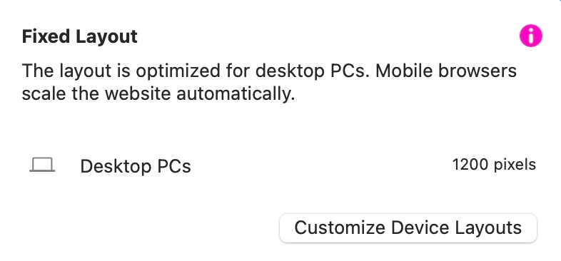
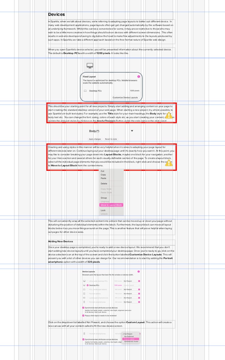
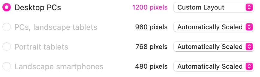
When you open Sparkle’s device selector, you will be presented with information about the currently selected device. The default is Desktop PC’s with a width of 1200 pixels. It looks like this.

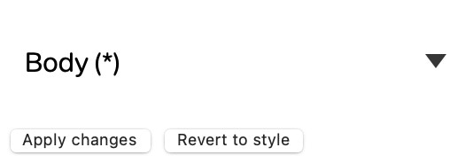
This should be your starting point for all new projects. Simply start adding and arranging content on your page to start creating the standard desktop version of your web page. When starting a new project, try, where possible, to use Sparkle’s in-built text styles. For example, use the Title style for your main headings, the Body style for your body text etc. You can change the font, sizing, and colors of each style etc. as you start creating your content, and then update the relevant styles by clicking on the Apply Changes Button under the style name in the style panel.
Creating and using styles in this manner will be very helpful when it comes to adapting your page layout for different devices later on. Continue laying out your desktop page until it’s exactly how you want it. At this point, you may like to consider breaking your page down into Layout Blocks, maybe one block for your navigation, another for your Hero section and several others for each visually definable section of the page. To create a layout block, select all the individual page elements that you would like included in the block, right-click and choose the option to Move to Layout Block from the context menu.

This will conveniently wrap all the selected objects into a block that can be moved up or down your page without disturbing the position of individual elements within the block. Furthermore, the layout block can move all layout blocks below it as you move things around on the page. This is another feature that will prove helpful when laying out pages for other device sizes. Note: When a layout block is first created it will be styled with one of Sparkle’s wireframe colors. This is just to let you know you’ve created a layout block and makes it instantly visible on the canvas. You can remove or change the color at any time by changing the fill in the style panel.
Once your desktop page is completed, you’re ready to add a new device layout. We recommend that you don’t start adding new device layouts until you have completed your desktop page. Once you’re ready to go, click on the device selection icon at the top of the screen and click the button labelled Customize Device Layouts. This will present you with a list of other devices you can design for. Our recommendation is to start by adding the Portrait smartphone option with a width of 320 pixels.
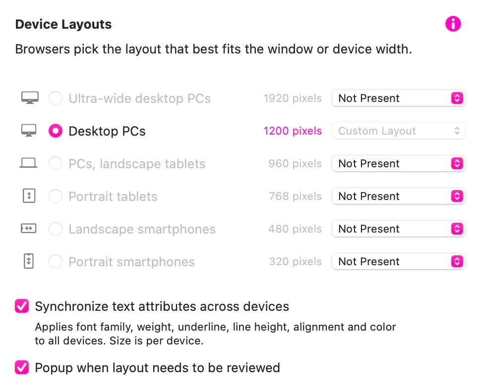
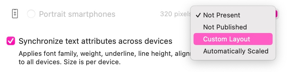
Click on the dropdown list labelled Not Present, and choose the option Custom Layout. This action will create a new canvas with all your content scaled to fit the new device screen.
The first thing you’ll probably notice is that the text is incredibly small and almost impossible to read. Also, all the images have been scaled proportionately. Clearly, this page now needs some rearrangement to make it suitable for viewing on a smartphone screen. But, if you followed our earlier advice about using text styles, everything can be scaled up to a more acceptable size by making changes to your text styles in the styles panel.
Remember, text styles are applied on a device-by-device basis. This means that any changes you make to a text style will only apply to the device you are working on. In our example, the body text style on our desktop variant was set as 15pt. When we switch to the smartphone layout, it’s been reduced to 4pt. We can now change this text style to say 12pt and again, update the style by clicking on the apply changes button in the style panel. This will have the effect of changing the font size of ALL body text on the smartphone layout to 12pt. We do the same thing with any other text styles in use. For example, our desktop titles may be set to 28pt, whilst on our smartphone layout, they are set to 18pt.
These changes will have an instant effect on our smartphone layout. It will now look something like this.
All the text has now been resized to legible levels, but the text boxes need to be resized to contain the newly enlarged text. This is denoted by the red outlines on the text boxes. These indicate that there is more text in the boxes than can be seen on the screen. This is easily rectified with a few simple manoeuvres.
The first thing to do is extend the length of the smartphone page to give ourselves plenty of room to work with. The next step is to drag the bottom resize handle of the topmost layout block to enlarge it so we can adjust the size of its content. Dragging the bottom resize handle will push all the other layout blocks down the page, creating a large space so we can work on the content of the first layout block.
All that now needs to be done is to grab the resize handles of each text box and drag until the red outline disappears. You can move the elements about within the block so that they fit better within the available space. If you need more space, just enlarge the layout block some more. Here is our mobile page starting to take shape.
In most instances, designing a desktop version of your web page and a smartphone version will be sufficient to allow Sparkle to handle the intermediate sizes for you. By adding other devices between desktop and smartphone. you can simply have Sparkle autoscale the different devices. To do this, you would simply set the option to Automatically Scaled against each device variant.
Of course, there is always the option of setting each device to have a Custom Layout if your page design calls for it. For example, you may want to create a web page similar to the one illustrated below.
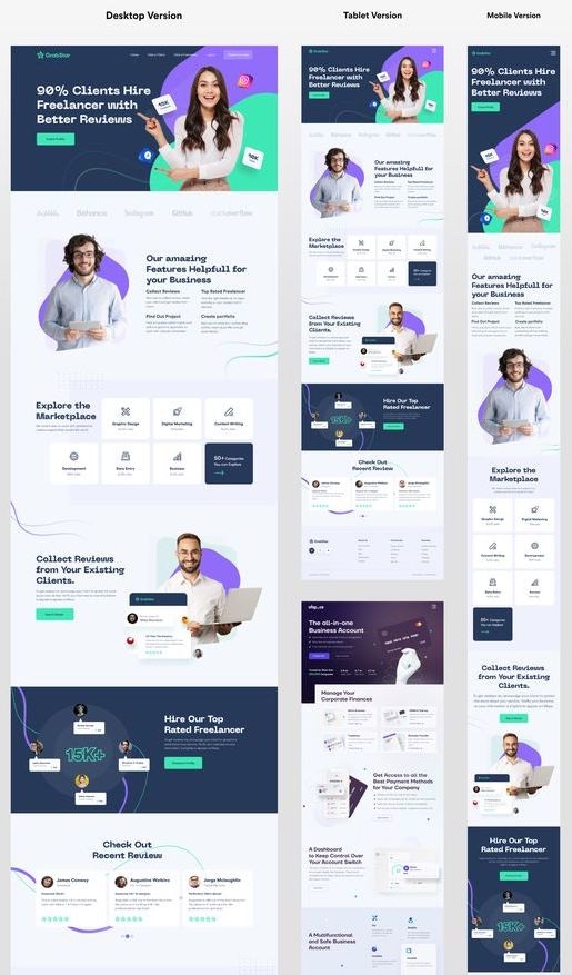
In this example, the desktop site is designed on a predominantly 2 column structure with some layout blocks being built on a 4 column structure. In the tablet version, there is predominantly 2 and 3 column grid layouts, whilst on the mobile version its a predominantly single column structure with some blocks being built on a 2 column structure. The choice of underlying grid structure really depends on the amount of text to be displayed and the image density of the page. Fortunately, Sparkle has you covered when designing for different devices in this way.
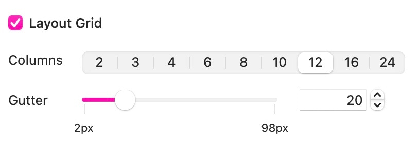
The standard underlying grid structure for a desktop version of a website is typically 12 columns, This make the page divisible by 2, 3 and 4 columns, in addition to a full 12 column width. However, when looking at intermediate device sizes, it may be preferable to change the grid structure to better suit the page layout you have in mind. In the above example it may be preferable to organise the tablet page on a 4 or 8 grid structure, whilst the mobile version may be better suited to a 2 column grid structure.
To accommodate this requirement, Sparkle offer a device-by-device grid structure, so you can set up your desktop page to use the standard 12 columns, whist the tablet and mobile pages can be set up to use 2, 4 or 8 columns, depending upon individual needs. You set the device grid from the layout Grid Selector at the top of the sparkle screen.

Please report any shortcoming in this documentation and we’ll fix it as soon as possible!
Updated for Sparkle 5.5
This website makes use of cookies.
Please see our privacy policy for details.
It’s Okay
Deny